Post by cg on Oct 6, 2011 21:24:11 GMT -6
So I toyed around with a photoshop clone and a website that allows for custom uniform design and came up with some ideas, since this is about the time where memberships are locked in and people are starting to come up with dues and the like. I tried to stick with the schools' varsity athletic team setups when possible while keeping the spirit of how the dodgeball clubs' past uniforms have looked. I'll post some others in a few days. I think DePaul will like theirs in particular - it fits their mindset.

First on the list is the Spartans. I got started on this since MSU football is unveiling their Pro Combat uniforms next week against Michigan and wanted to see what the dodgeball team would look like in a similar getup. Informal feedback overwhelmingly rejected bronze in favor of silver, and the outlines to the numbers were removed to significantly save on cost. The Spartan logo and greek text Molon Labe (transl: "Come and take them") are embroidered into the collar.

Next up is Big Ten mainstay Ohio State. Their team has also received Pro Combat gear. These were for an away game, so the Scarlet and Gray were prominent on the shorts and shoulderpads. I did what I could with the sleeve and cuff options, and made sure to get the "O" in a place of prominence, screenprinting it just below the collar.

SVSU dodgeball's team color scheme has bounced around a bit over the years, so that gave me some freedom from doing predominantly black with school color highlights, which most schools try to do one way or another. Still, I wanted to do something special for these guys. They're a team focused on offense and I wanted to highlight that somehow. Instead of cluttering their uniform with logos or mottos and names, I eliminated that in favor of two things no other jersey has: logos on the sleeves and an asymmetrical design, changing the color of the throwing arm and putting the attention where it needs to be - the dodgeball coming at you at 65+ mph.

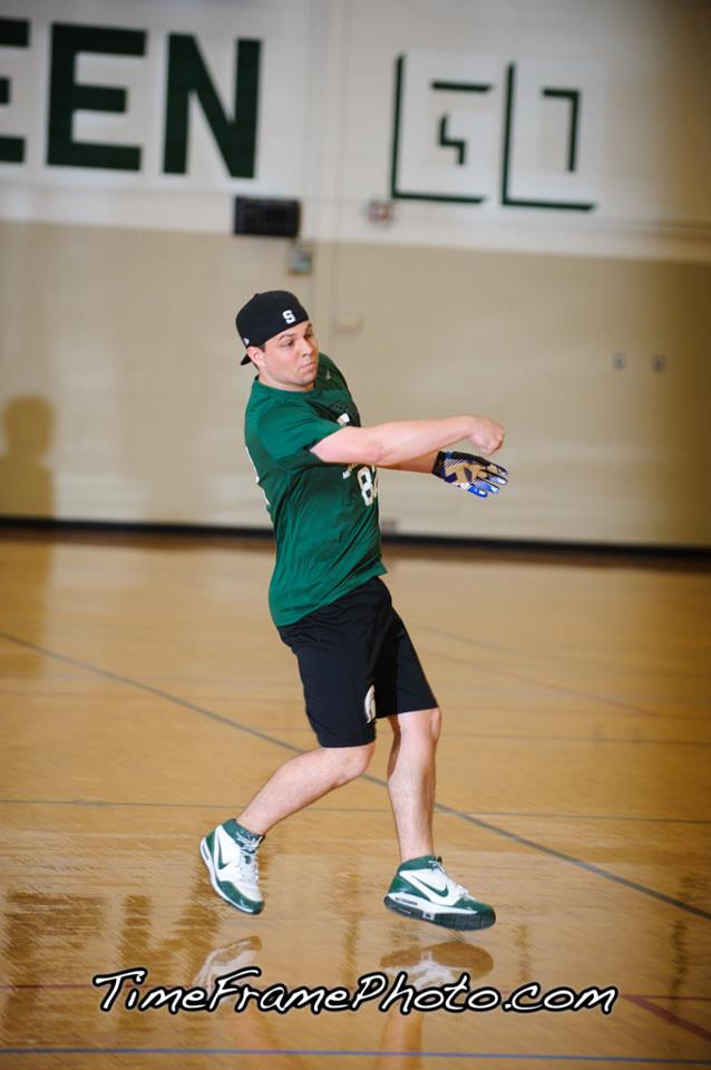
Bowling Green historically uses a very clean uniform design, so I didn't want to stray too far from that. Using a soccer concept and a smaller number on the front side left plenty of negative space - too much, in fact. A brown Falcon logo helped diminish that. As an added touch, "Forward Falcons," part of the BGSU fight song, has been embroidered into the back collar.

WKU has always had elaborate sleeves, so changing that didn't seem to fit. There just didn't seem to be a whole lot I could do to their set. Eventually I remembered a conversation with the (other) Big Giant Head, Josh Raymer, and found the team slogan: "Where the rubber meets your face." In tribute to that, the words have been embroidered all around the collar, along with a simplified WKU logo.

Next up is the University of Kentucky. UK basketball has a very storied tradition and has kept a very basic look throughout the years. So has their dodgeball team, so merging the two seemed straightforward enough. White replaces blue as the primary color, with the exception of the blue collar and familiar block script font.

You always see football teams with bowl game patches. Basketball teams will add logos to their NCAA tournament or invitational jerseys. I thought CMU needed something like that. While it made for "eh" viewing in the first half, that finish was an instant classic for many reasons. A little recognition is deserved. Enter the ostentatious Championship sash separating the school logo and front numbering.

Last up for tonight is Eastern Michigan. I wanted to give Eastern a bit more of an identity - the E just doesn't do it for me. Their basketball team uses the player number to split the school name, and it made for a good distinction in the NCDA, since no other school uses it to my knowledge. The simplicity of it also helps keep the per unit cost down, a necessity for all relatively young teams.
First on the list is the Spartans. I got started on this since MSU football is unveiling their Pro Combat uniforms next week against Michigan and wanted to see what the dodgeball team would look like in a similar getup. Informal feedback overwhelmingly rejected bronze in favor of silver, and the outlines to the numbers were removed to significantly save on cost. The Spartan logo and greek text Molon Labe (transl: "Come and take them") are embroidered into the collar.
Next up is Big Ten mainstay Ohio State. Their team has also received Pro Combat gear. These were for an away game, so the Scarlet and Gray were prominent on the shorts and shoulderpads. I did what I could with the sleeve and cuff options, and made sure to get the "O" in a place of prominence, screenprinting it just below the collar.
SVSU dodgeball's team color scheme has bounced around a bit over the years, so that gave me some freedom from doing predominantly black with school color highlights, which most schools try to do one way or another. Still, I wanted to do something special for these guys. They're a team focused on offense and I wanted to highlight that somehow. Instead of cluttering their uniform with logos or mottos and names, I eliminated that in favor of two things no other jersey has: logos on the sleeves and an asymmetrical design, changing the color of the throwing arm and putting the attention where it needs to be - the dodgeball coming at you at 65+ mph.
Bowling Green historically uses a very clean uniform design, so I didn't want to stray too far from that. Using a soccer concept and a smaller number on the front side left plenty of negative space - too much, in fact. A brown Falcon logo helped diminish that. As an added touch, "Forward Falcons," part of the BGSU fight song, has been embroidered into the back collar.
WKU has always had elaborate sleeves, so changing that didn't seem to fit. There just didn't seem to be a whole lot I could do to their set. Eventually I remembered a conversation with the (other) Big Giant Head, Josh Raymer, and found the team slogan: "Where the rubber meets your face." In tribute to that, the words have been embroidered all around the collar, along with a simplified WKU logo.
Next up is the University of Kentucky. UK basketball has a very storied tradition and has kept a very basic look throughout the years. So has their dodgeball team, so merging the two seemed straightforward enough. White replaces blue as the primary color, with the exception of the blue collar and familiar block script font.
You always see football teams with bowl game patches. Basketball teams will add logos to their NCAA tournament or invitational jerseys. I thought CMU needed something like that. While it made for "eh" viewing in the first half, that finish was an instant classic for many reasons. A little recognition is deserved. Enter the ostentatious Championship sash separating the school logo and front numbering.
Last up for tonight is Eastern Michigan. I wanted to give Eastern a bit more of an identity - the E just doesn't do it for me. Their basketball team uses the player number to split the school name, and it made for a good distinction in the NCDA, since no other school uses it to my knowledge. The simplicity of it also helps keep the per unit cost down, a necessity for all relatively young teams.